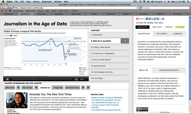
Geoff McGhee is an online journalist who works on data visualization at Stanford University, where he has produced Journalism in the Age of Data. The project, which encompasses a video documentary on different approaches to data visualization, has a segment dedicated to journalism, and discusses how “Data Vis” is starting to create changes in newsrooms.
Other websites to pay attention to are Many Eyes which has an application that helps you convert your data (in Excel) into visual information, and DJB (Data Journalism Blog) created by digital journalist Marianne Bouchart.
Also, if you haven’t checked them out yet, Flowing Data, Infosthetics and Fathom are great resources.
Martin Wattenberg’s site Bewitched is also full of great ideas. Wattenberg is a co-leader, with Fernanda Viégas, of Google’s “Big Picture” data visualization group.
